Quilt Design: How to Use a Warm/Cool Color Palette

Fabric Drives the Quilt Design
This warm and cool color quilt came about because I was thinning out my fabric stash. I happened upon a stack of charm squares from the Florence collection by Denyse Schmidt for FreeSpirit Fabrics.
I fell in love with this colorful and modern fabric collection all over again.
Color Makes this Quilt
This fabric collection has two distinct colorways. Red/orange (warm colors) and blue/green (cool colors). I decided to make a quilt that focused on each of the color stories equally and showed how they work together. I decided that half of the quilt would feature warm colors and the other half would feature the cool colors.
The Perfect Quilt Block pattern
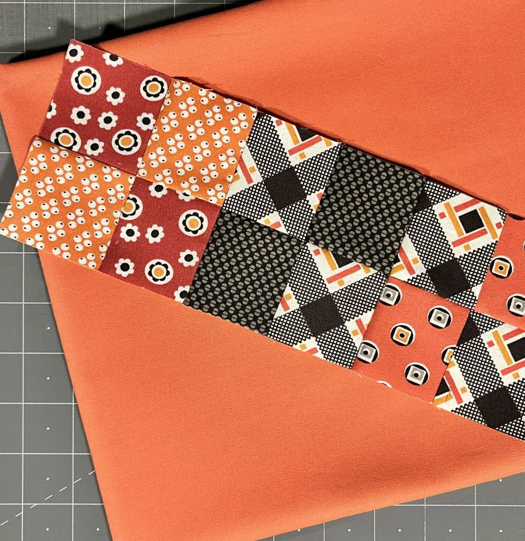
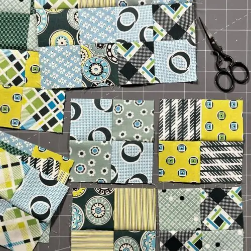
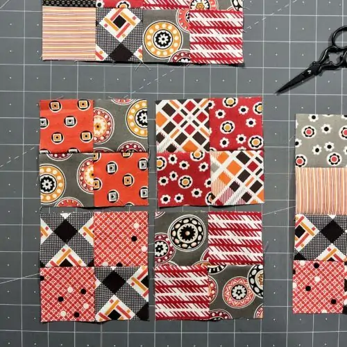
Several of the charms had already been cut into 2.5″ X 2.5″ squares. The easiest block to make was a simple Four-Patch. I separated the charms into stacks of warm and cool colors and started sewing.
After sewing all of the 2.5″ X 2.5″ squares together, I paired up most of the remaining 5″ X 5″ charms and created several larger Four-Patch blocks. I always use the Creative Grids® Turbo 4-patch ruler whenever I’m making Four-Patch blocks. It allows me to create a block with perfectly matching seams quickly and easily.
Finally, I sewed the remaining 5″ X 5″ charms together to create larger Four-Patch blocks.
The Final Design
Since I did not have enough charm squares to make a full quilt, I decided to fill the empty space with a solid color.
My first idea was to fill the space with a dark gray solid. I thought it would provide a nice contrast to the charm squares.
So, I experimented with that idea using rows of four-patch blocks in the middle of the quilt and the dark solid at the top and bottom. Then, I experimented with one colorway of four-patch blocks at the top and the other at the bottom with the dark fabric in the middle.
I didn’t really like the look. When I stepped back to view the whole quilt, the dark solid seemed to be the focus. Not what I was going for. The charm pack fabric needed to be the star of the quilt.
Making the Most of Two Color Palettes
Time for something unpredictable. It was time to pull out my Kona® Cotton Solids Color card. My idea was to find one warm color and one cool color that matched the warm and cool colors in the Florence fabric collection. But, the colors also needed to have the same tone.
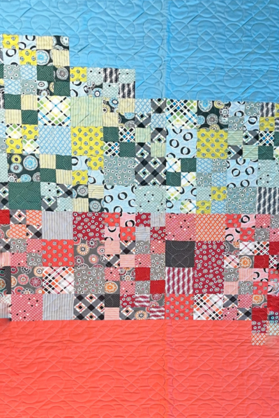
One solid color would be at the top of the quilt and flow into the matching charm square fabric. The other solid would be at the bottom of the quilt and flow into the warm colored squares. The Four-Patch blocks would form a mirror image in the middle. Below is the quilt I imagined.
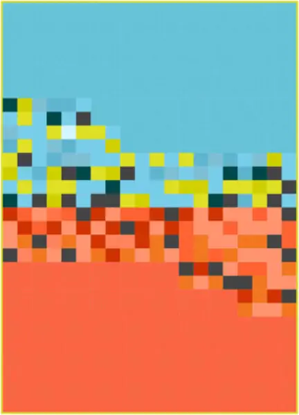
Bottom: Kona® Nectarine
Color Decisions
The Kona® Cotton Solids Color card is perfect when you need to find colors that match, complement, or blend with other colors. There were several colors that I considered for both the cool and warm solid fabric sections. Basically, I compared several color/pattern combinations from the fabric collection to the solid color swatches.
Here are the colors I considered based on the colors in the Florence fabric collection.







In the end, I chose to use Waterfall and Nectarine because I liked the look. Blue and orange are opposite to each other on the color wheel after all.
But, why not use Persimmon if position on the color wheel is what drove the choice? Because the tone of the blue and orange represented by Waterfall and Nectarine felt more similar.
The Warm and Cool Quilt
Below is an image of the actual quilt top. It finished at 43″ X 66″. The fabric requirements are listed below the photo.
