The Quilt Design Trifecta
- Color Value: The Essential Quilt Design Element
- The Quilt Design Trifecta
What Do I Mean by Quilt Design Trifecta?
Have you noticed a trifecta trend? Lately, I’ve seen and heard the word ‘trifecta’ everywhere.
I can order the ‘Trifecta’ at my favorite breakfast place. It includes eggs, meat, and a waffle. Many Creole and Cajun recipes begin with a trifecta of celery, onions, and peppers. Recently, I saw the word ‘trifecta’ in a magazine used to describe vintage home design – “tall, elegant windows, paneled wood doors, and tons of built-in storage”.1
So, I started to wonder if there is a trifecta for quilts. You know, are there three things that when used together result in a pleasing quilt? Honestly, there might be more than three design elements. But, for me color, pattern, and texture are the basics of unique quilt design.
Trifecta: a group of three desirable things that happen or come together at one time.
Webster’s Dictionary
Color, Pattern, Texture
Think about it. You could take a specific color combination, a particular fabric (texture), and a single block pattern and make a unique quilt. If you kept two of those factors (color and texture for instance) the same but used a different block pattern, it would yield a quilt with a completely different look.
This just might be the reason that quilting appeals to so many of us. There is no ‘right’ combination of elements. And creativity thrives with so many choices.
Let’s look at the parts of the trifecta one by one.
Color – Quilt Trifecta Element 1

Okay, just let me say that there is no particular order of importance for the parts of a trifecta. The whole point of a trifecta is that all the parts are equally desirable and necessary. So, while color might be the first thing you notice when looking at a quilt, it by no means trumps the roles of pattern and texture.
At it’s most basic, color or hue is simply blue or red or yellow or green or purple, etc. If you consult a color wheel, you learn that these hues can be further described as primary, secondary, and tertiary colors. But, it is how the colors work together that creates great design. The right mix of colors can be powerful. The wrong mix of colors can be unsettling.
I’ve stepped back from my design wall more than once and thought ‘meh’ when looking at my latest project. At that point you either take the time to figure out what you don’t like or it just becomes another unfinished project.
And that’s not because it was too time-consuming or hard, but because something just didn’t look right.
How Do You Choose the ‘Right’ Colors?
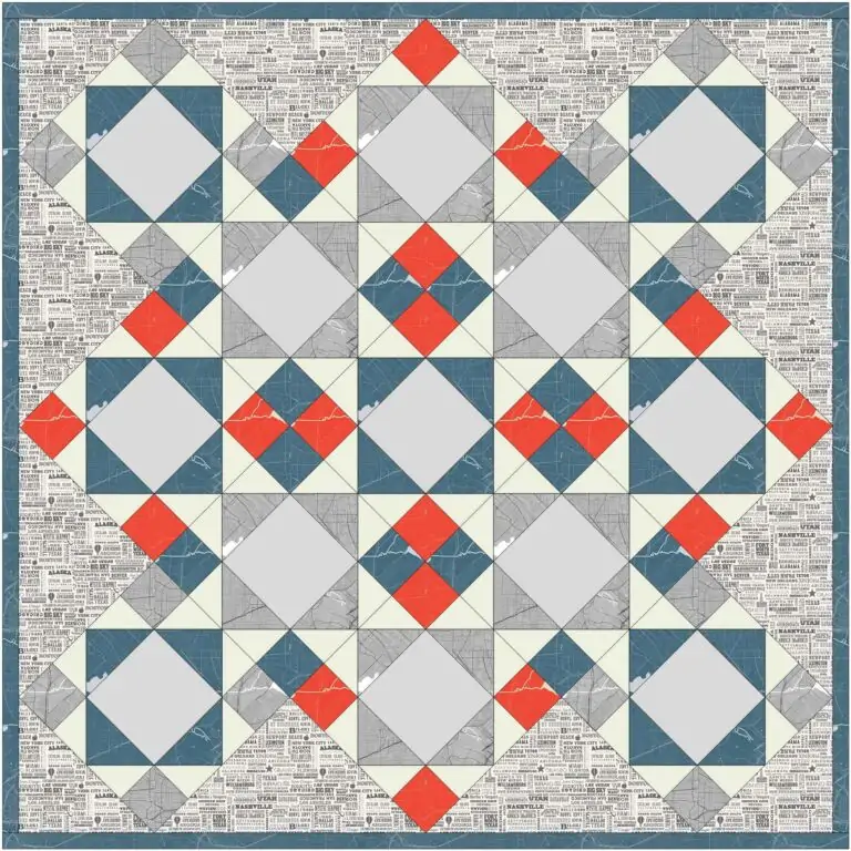
Color combinations lend a quilt an air of sophistication, playfulness, or peacefulness. It all depends on the colors chosen. So, when you are designing a quilt, it is worthwhile to consider the overall mood you want to evoke. A quilt in reds, oranges, and yellows is ‘warm’ and energetic while a quilt made with blues, greens, and teal is ‘cool’ and calming.
A ‘warm’ design with a single cool color added in is like dropping an ice cube in a cup of too hot coffee. It cools it off just enough. The same goes for taking the chill out of a quilt with too many cool colors. Read more about using warm and cool colors in quilt design here.
Choosing colors for a quilt can be a daunting task though. It all begins with that first color choice. After that you must determine the color values and color relationships that will best show off your design.
And that is where the next element becomes important. The block/quilt pattern will often help you decide how many colors to choose and whether they should be light, medium, or dark. And that is because color value (light, medium, dark) can actually be more important than hue when making a pleasing design.
Pattern – Quilt Trifecta Element 2
The pattern in the fabric (floral, stripe, geometric, solid) definitely impacts the overall quilt. However, the shapes used in the blocks provide definition and can impact how the viewer’s eye moves over the entire quilt top. We need to consider both.
Block Patterns
I love vintage block patterns. Usually, they lend an overall symmetry to the quilt top. Symmetry is soothing because the eye knows what to expect.
I once met a quilter who told me she only made Log Cabin quilts. She said it was her favorite block. I’m going to guess that none of her quilts looked the same though. I feel certain that every quilt boasted different colors, block layouts, and perhaps even textures.
Want a really unique quilt with lots of personality? Try a modern design. Sometimes symmetrical and sometimes not. Many modern quilts have a lot of negative space which provides space for the eye to rest.
Certain block patterns create 3D effects that are stunning. The Baby Blocks quilt is a classic 3D design, but take a look at the vintage block images below. It is the same pattern, but the use of different color values in specific patches makes the one on the right appear 3D while the other is flat.


The Fabric Pattern
There are fabric collections to meet your every desire. Plaids, stripes, and gingham in every color. Fabric designed for children. Floral and geometric designs. Large, medium, and small scale prints.
In fact, pre-cuts are very popular with quilters because they include all the prints in the fabric collection. Large, medium, and small scale prints are included. And, bonus, all of the colors work well together thanks to the designer.
The pattern in the fabric often dictates the block patterns and overall quilt pattern. Bright geometric fabrics might be the go to for more modern quilts. A floral, muted fabric might suggest a vintage quilt block. The beauty is that there are no rules and you get to choose what fabrics to use and how to use them.
Texture – Quilt Trifecta Element 3
I’ll admit that texture was not my first thought when considering a trifecta for quilts. I don’t know why. Every single quilt has texture.
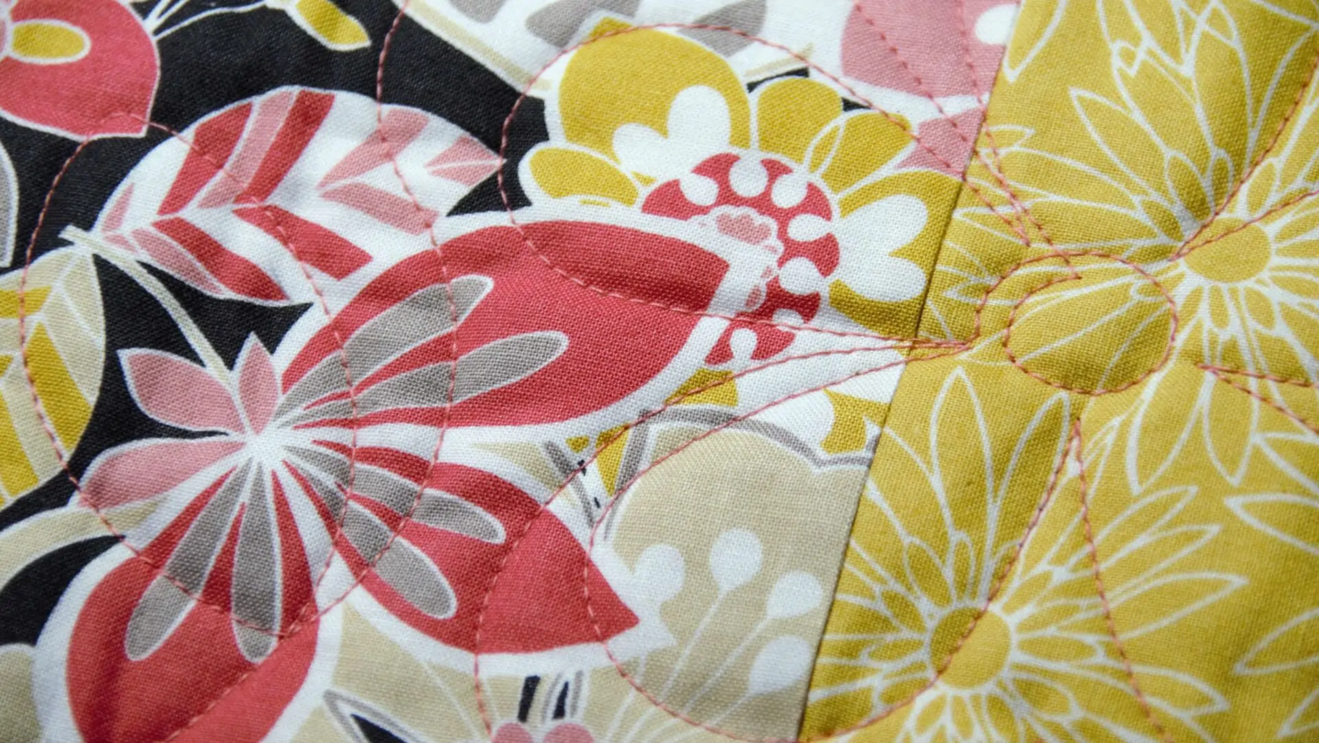
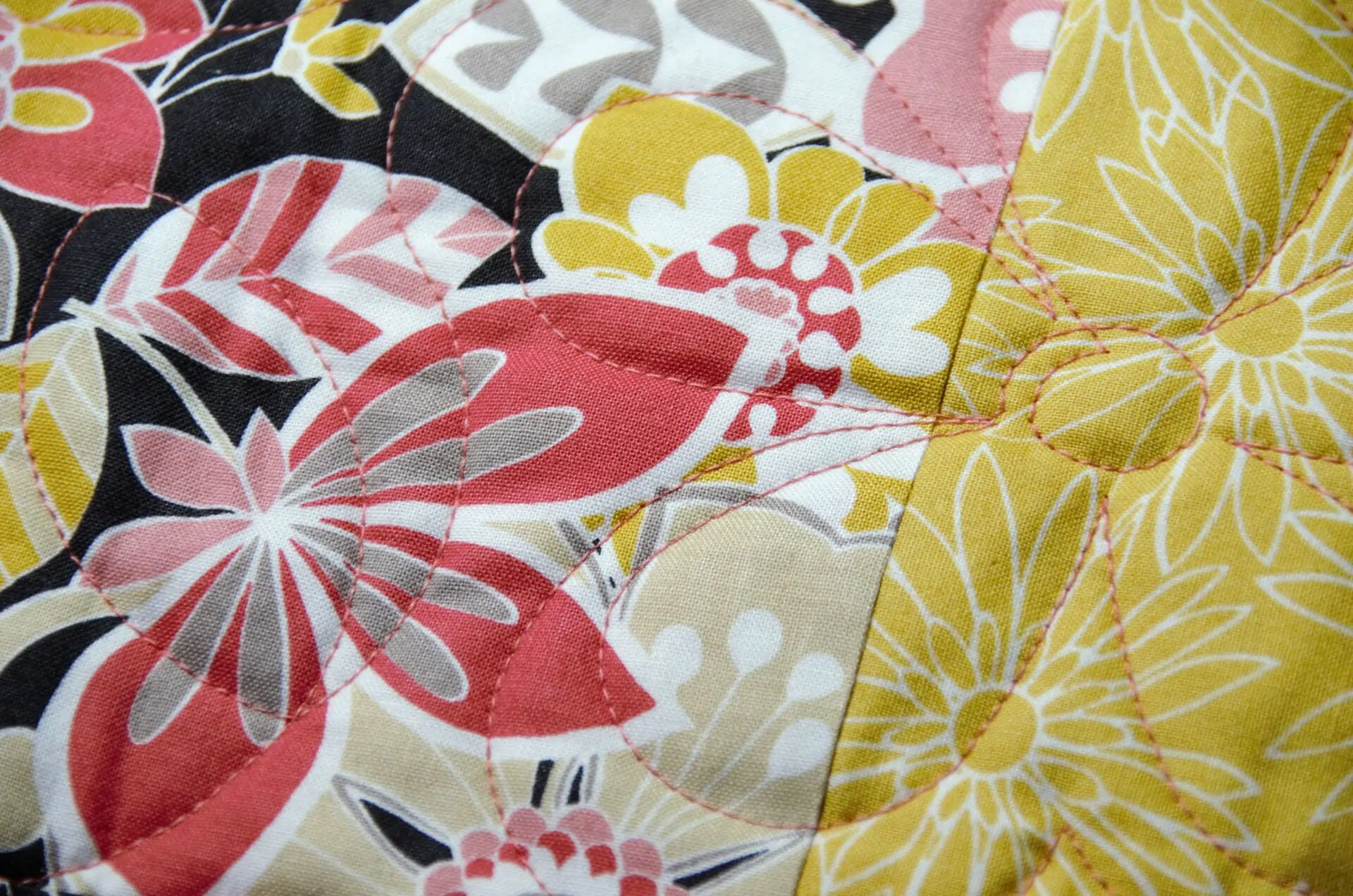
Stitching Is Texture
The very act of ‘quilting’ the top creates texture. In fact, I use solid backings because I love how I can see the texture created by the quilting stitches. Even tying a quilt adds a unique texture and can accentuate a vintage pattern.
Applique lends texture because fabrics are sewn on top of fabrics. Machine applique often includes decorative stitches. The stitches, of course, provide yet more texture.
Many quilters use embroidery to embellish their designs. In some cases, the embroidery is the focus of the quilt blocks.
Fabric Texture
Then, there is the fabric itself. I normally use smooth cotton fabrics. But, I plan to design a foundation paper piecing pattern using woven cottons this year.
But, quilts have been sewn from so many different fabrics over the years. Vintage quilts almost always contain bits of clothing. I have several orphan blocks that include fabric scraps from clothing. I even have a corduroy quilt that my grandmother made (pictured below).

Then, there are Crazy Quilts made of velvet, satin, and even corduroy. Always embellished with decorative stitches and in some cases buttons and beads.
And, I took the picture below of a Courthouse Steps quilt I recently found at an antique store. Satin and velvet were the main fabrics used.

I even saw a denim quilt recently that was included in a local quilt show. If I remember correctly, it had decorative stitching and a bit of embroidery as well.
Follow Along
I want to spend 2024 exploring more about the Quilt Trifecta and sharing what I learn along the way. Look for blogs about color choices, new texture trends, and even a few free block patterns. I’ve got both vintage and modern patterns in mind.
If you’re interested in learning more about how to use color, pattern, and texture in your quilt designs, sign up and follow the blog!
Footnotes